Quantcast
Channel: photography – Katherine Wikoff
Viewing all 87 articles
Browse latest View live

Chasing light – afternoon sun in the city

$
0
0

When I left my office around 5:00 this afternoon, the first thing that caught my eye was this tree’s orange leaves, illuminated by the slanting rays of the sun.  The tree fairly glowed in the shadows of downtown Milwaukee office buildings beneath the blue sky. 

The effect was already starting to diminish by the time I dug out my iTouch.  When I snapped my second shot, just moments later, the light was gone.

 My great-grandfather was an avid amateur photographer.  He kept his camera and tripod in the trunk of his car, and if he was out driving and saw something he thought would make a good picture, he’d pull over right there and set up his gear.  He has always been my role model for how to maintain an artistic life in parallel with your everyday existence. 

Years after my great-grandfather died, I discovered Ansel Adams’ Moonrise, Hernandez, New Mexico.  Not only is Adams’ photograph a masterpiece, but I felt my great-grandfather’s presence and had to laugh when I heard the dramatic story of how Adams shouted to his friend to pull the car over to the side of the road and then worked frantically to set up his equipment and capture the twilight image of faded sunlight reflecting on white cemetery crosses under a newly ascended moon.

Just looking at my two photos above, you can see what a difference a mere moment can make when you want to photograph an ordinary object or event rendered fleetingly beautiful by the elusive, magical quality of light.


A Tim Burton full moon (photo)

$
0
0

Doesn’t this gorgeous full moon look like something filmmaker Tim Burton might order up? 

Moon and clouds a la Tim Burton

Actually, this is last month’s full moon (December 2012).  I had completely forgotten I’d photographed it until today, when I was working with some other pictures from my camera.

Here’s another photo, shot just a minute or so later.

Tim Burton moon - 1

Although its overall look doesn’t appeal to me as much as the first photo (I love the illuminated cloud strata in that one), I like how the moon in this second photo appears to be entrapped inside a thorny cage. 

What’s actually going on is that light from the moon was SO BRIGHT that evening as to completely obliterate the branches’ silhouettes where they crossed over the orb — thus, creating an impression of individual tree “fingers” clutching at it.

Cool, right?


#iphoneography

$
0
0

I just discovered a terrific Twitter hashtag: #iphoneography.  (There are also parallel hashtags #iphonegraphy and #iphonography.) If you love photography, you’ll enjoy following this “conversation.”  You probably already know about it, in fact.  I’m usually late to the party.

Basically #iphoneography, et al., is post after post, photo after photo taken by mobile phones and posted via (usually) Instagram.  For some reason the clouds in this photo put me in mind of Michelangelo’s “Creation of Adam” painting on the ceiling of the Sistene Chapel . . .

. . . or, as Justin Bieber called it on David Letterman, for which he was then shamed by the host at about 8 minutes into the interview, poor kid, the “Sixteenth Chapel.”

Really beautiful photos.  It’s amazing what’s happening in photography today.

And, while I’m thinking of it, it’s also amazing what has happened in the past.  If you’re anywhere near Milwaukee before May 19, 2013, you should check out the Milwaukee Art Museum’s “Color Rush” exhibit, celebrating “75 years of color photography in America.”


Marbleized shadow (photo)

$
0
0

IMG_0213[1]

What is this?

Maybe this will help.

IMG_0210[1]

I stopped at the store on my way home from teaching last night and parked under one of those tall, bright lights at the edge of the lot.  As I pulled out my grocery list, I noticed that the overhead light was casting shadows from the raindrops that streaked the windshield down onto the notepad in my hand.  (Yes, it was raining again last night.)

To me, those shadows made the paper look like marble.  So I took a picture.  Then I realized the photo would look way more attractive without my shopping list (milk, bread, eggs . . .), so I flipped the page to the next sheet.  But even without the list, I still had those lines on the paper.  Finally I thought of flipping over the notepad itself and photographing the shadowed gray cardboard.

I like it!

IMG_0214[1]


“Criss-cross” (photo)

$
0
0

Really liked the intersecting lines and distorted angles of the condensation trail, power lines, and downtown buildings.  So I had to take a photo :) 

Just finished teaching and am ready to call it a day.  Happy Tuesday evening!

"Criss-cross"


Slight chance of sunshine

$
0
0

Foggy morning in Milwaukee.  You can barely make out the sun peeking over the corner of the building at center, a circle of light only a shade brighter than the surrounding mist.  This is a color photo, by the way.  No filters or Photoshop.  Just a cool, gray start to the day.

(Hey, I just noticed something cool.  If you tilt the screen one way, the sun gets more visibly light.  And if you tilt it the other way, it gets more visibly dark, like a film negative.)

foggy morning sun - May 29, 2013


Surf’s up!

Champagne and Christmas Tree Lights (Photo)

$
0
0

Champagne and Christmas Lights

Taken with my iTouch last night when I noticed how the lights of our tree sparkled through my midnight champagne.  Happy 2014!


Shadow and architecture, Grohmann Museum

$
0
0

Grohmann Museum

I couldn’t resist snapping this photo with my iPhone just before 5:00 p.m. this afternoon in the Grohmann Museum on the campus of Milwaukee School of Engineering.  As I approached the atrium’s spiral staircase on the way from my office to copy machine, I was struck by the patterns of shadow and light, glass and steel.


Reflections on “Man at Work”

$
0
0

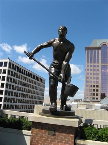
These  giant (9-foot) statues line the Grohmann Museum’s rooftop sculpture garden.

Grohmann statues

Bronze statue atop Grohmann Museum, via Urban Milwaukee Dial, “One Piece at a Time: A Thousand Little Pieces,” by Judith Ann Moriarty, August 19, 2011 (http://urbanmilwaukeedial.com/2011/08/19/one-piece-at-a-time-a-thousand-little-pieces/)

“Rooftop Sculpture Garden” (from msoe.edu)

As I was walking into my building this morning, I saw this reflection in the windows of the office building across the street.  When I saw the statues’ silhouettes in the glass, I decided to take a picture.

Grohmann Museum rooftop sculptures

Then after dropping stuff off upstairs in my office, I ran to get coffee.  By the time I got back, the sun had emerged from behind a cloud.  What a difference a change in lighting makes in a photograph!

Grohmann rooftop sculptures

Coming into the building again much later in the day, around 4:15 pm, I noticed the sun hitting the statutes from the opposite angle.  I think of the three photos, this late afternoon one is my favorite.  It’s only an iPhone picture, but now I can look at the image whenever I like.  And if I ever decide to try for a better photograph, I can bring my good camera downtown on a similar afternoon.


Grohmann Statue and Shadow

$
0
0

image

We had to go outside for a fire drill two days ago at work, and while waiting for the emergency coordinator to come and tell us it was clear to go back into the building, I looked up and noticed how well defined and interestingly placed the shadow cast by this giant bronze statue on the roof was. Good thing I had my phone 😄


Making a Picture

$
0
0

The other day when I posted the “rainbow” light slanting through my office’s Venetian blinds, I mentioned that usually the light coming through is white and casts interesting shadows. Here’s an example of what I mean.

I take a lot of pictures, probably way more than I should mention. Most of them get trashed. I like the photo above. It took a while to get there, though. So I thought I’d share all the “fails” with you, in case you’d find it interesting to walk through my picture-making process.

First, I walked into my office either before or after my 1:00 class and noticed that the sunlight had cast its current pattern of blind stripes on my ceiling. The stripes show up in different locations all over my office walls and ceiling depending on the time of day or year.

Something about this pattern caught my eye. So, second, I snapped several photos with my phone.

ceiling tile fail 1 ceiling tile fail2 ceiling tile fail 3 ceiling tile fail 4 ceiling tile fail 5 IMG_1626[1]

Of all these, I decided I liked the last one best because of the diagonals.

Then, having chosen it as my favorite, I then started thinking about the composition of all the various lines and how they might best fit inside a “frame.” In other words, should I crop the photo? And if so, how?

I wanted to merge the patterns of lines into a coherent “whole” as much as possible, so that the ceiling tiles and Venetian blind stripes could be viewed as one single unit instead of two separate overlapping patterns. So yes, cropping would be necessary to create that illusion.

In the end I decided to shave a little bit off the top of the photo and then crop the sides and bottom enough to create a “frame” that would put the edges right at the outermost points of the pattern created by the Venetian blind stripes.

Below are the “before” (left) and “after” (right) versions.

IMG_1626[1] abstract pattern - ceiling tiles and Venetian blind shadows

So, that’s today’s blog post. Not especially “deep” but sort of different and hopefully interesting, too:)


Panorama of the Panorama!

$
0
0

I stopped in this morning to see the Grohmann Museum’s new exhibit.

Although it opened May 27, I’ve only been in the building since then during hours when the gallery is closed. Last week was finals, and between holing up to grade over the weekend while also prepping to lead my Great Books event Wednesday evening (we talked about Annie Baker’s The Flick, which won the 2014 Pulitzer Prize for Drama), I just haven’t been around much in the daytime.

First of all, by the way (and just because . . .), here’s a photo I took of the Grohmann’s entrance atrium as I left the building around 9:00 Wednesday evening after dropping my laptop and other materials at my office when Great Books ended. The “gloaming” twilight made everything more striking somehow than it is during the day. The general public is never inside the museum at night except during Gallery Night, and then all the inside lights are on, meaning you’d never be able to see this exact view anyway, with the bluish-purple evening light illuminating the staircase through the arc of glass walls. So I thought I’d share:)

image

Okay, back to the new exhibit. It’s called “Milwaukee’s Industrial Landscapes: Paintings by Michael Newhall” and it runs May 27–August 21.

image

The showpiece of the exhibit is a massive 9-panel panorama of Milwaukee’s Walker’s Point neighborhood. It takes up a whole wall by itself! I couldn’t resist taking a “panorama of the panorama” just to see what it would look like. It’s pretty cool! (You can click on the photo to enlarge it to full screen.)

"Walker's Point Pan, 1984-87" by Michael Newhall

image

And then there’s also this other painting I liked that struck me as really different and intriguing.

"Alley Behind Factory, Chicago, 1983" by Michael Newhall

image

You may be able to experience what I’m getting at if you click on the photo of the painting above to enlarge it. (Don’t double click, for you’ll get an enlargement so huge you can see the canvas weave, which is sort of fun but also way too big for the point I’m making:) ) Or you can just look at the smaller section enlarged below (or even click on it to get a larger version of just this portion of the painting, if you like.)image

Look at how crisp the detail of the two houses is compared to the trailing tree branches in the foreground and the factory building in the background. It’s like this painting somehow approximates the shallow depth of field you might see in a photograph taken with a telephoto lens. I’ve never noticed a painting do this before (possibly because I just don’t visit enough galleries and museums), and I really like the effect this technique has on the painting.

Or maybe I should say on the viewer’s experience of this painting.

When I focus my gaze on the chimneys of the yellow house, suddenly the foreground and middle ground elements seem to come closer to me while the cocoa-colored factory in the background simultaneously recedes and rushes forward. Your mind’s eye recognizes the building’s distance while also perceiving its abnormally close presence and mass. It’s a very odd, disconcerting sensation of almost physical movement.

Can you feel it, too?


Bloom Where You’re Planted!

$
0
0

My equipment is no fancier than A) my older-model iPhone (a 5c, not even the 5s, which apparently had a better camera) and B) my Kodak Easyshare Z915 Digital Camera, which is no longer supported by the company and which I got on sale for $100 through Amazon about six years ago.

Despite the mediocre technology, I love taking pictures! One of these days I’ll feel flush enough to spring for better gear. Meanwhile, I’m going to make do and start setting myself up with “assignments”—sort of my own personal photography school:) —and just see what I can learn . . . about the cameras I have and about taking better photographs, period.

So here is a photo from my first (self-imposed) assignment, “Texture.” It’s the bark of a honey locust tree on State Street in downtown Milwaukee, taken with my iPhone 5c.

texture #1


Waiting for the Elevator (And My First-Ever Exhibit Submission)

$
0
0

While waiting for the elevator in my building, I decided to check my texts. Apparently the last app I’d used was my camera, because it was still active when I opened things up. The image that flashed onscreen before being replaced by text bubbles caught my eye, so staying perfectly still and holding my phone in exactly the same position, I clicked back to my camera.

Wow! I really liked the lines and shadows, so I balanced my coffee between my chin and the arm holding my phone and used my now-free thumb to snap exactly the image I had seen framed a few seconds earlier.

Waiting for the Elevator

I also did something new this past week. As part of my undergraduate university’s 50th-anniversary celebration in 2017, the last exhibit of the season at the campus’s Robert & Elaine Stein Galleries will be the 2017 Alumni Exhibition. All graduates of Wright State University’s College of Liberal Arts in the past 50 years were eligible to submit artwork for the juried alumni show.

So I submitted five photos! I’m not holding out a lot of hope that one of mine will be selected, but nothing ventured, nothing gained, right? And I’ve never done anything like this before. The only place I’ve ever “shown” my work is on this blog and on my office door. (Which is located inside an art museum, but I don’t think that really counts 🙂 )

It’s fun to try new things, and now I know a little more about how things work in the art world.

Here are the five photos I submitted. I’ll find out in about two weeks whether any have been selected. Keeping my fingers crossed . . . (and my expectations low 🙂 )

"Impermanent Fresco"

“Temporary Fresco”

"Grohmann Museum, Steel and Shadow"

“Grohmann Museum, Steel and Shadow”

"Autumn Afternoon Light, Twice Reflected"

“Autumn Afternoon Light, Twice Reflected”

"Chihuly Dream"

“Chihuly Dream”

"Grohmann Museum, November Rain"

“Grohmann Museum, November Rain”


Accepted!

$
0
0

I am SUPER excited to share that two of my photographs have been accepted for inclusion in the 2017 Alumni Exhibition at Wright State University!

Grohmann Museum, Steel and Shadow

Grohmann Museum – Temporary Fresco

The exhibition will be presented at the Robert & Elaine Stein Galleries from May 12 through June 9, 2017. There will be an opening reception on Friday, May 12 from 5:00-7:00 p.m. in the Stein Galleries.

So now I have more stuff to learn—like how to print, frame, and ship my photographs to an exhibition. I’m also wondering if there’s any way I can work it out to be at that opening reception. I teach two classes on Friday afternoons, but I maybe I could switch around what I’d been planning to cover on that day (Friday of Week 9 in our quarter) so that a colleague could sub for me relatively easily. On the other hand, then I’d have the stress and expense of getting myself down to Dayton (Ohio) and back to Milwaukee over a weekend.

Oh, well. One thing at a time. Meanwhile, I’m going to enjoy (bask in!) the euphoria of knowing my photos have actually been accepted!


The “Kicker”

$
0
0

I couldn’t think of a good title for this post (“Cement and Metal”???) until I circled back to the one detail that had caught my eye in the first place and made this a photo worth snapping.

Because I’m teaching the Film Studies course this quarter, all of the cinema-related vocabulary I know is near the surface of my brain right now. A “kicker” is a light placed behind the subject to add definition, often in the form of “edge” or “rim” lighting.

Below is an example of rim lighting from my fave campy film-noir movie, Sunset Boulevard. What do you think? Was “The ‘Kicker'”a good title? 🙂


Color and Composition

$
0
0

I liked the sudden coalescence of color and composition that caught my eye while I was walking down the hill to Starbucks this morning.

The impact of “small” differences

$
0
0

I happened to look up as I was walking into the Red Arrow Starbucks this morning, and I saw a photo. I took a couple pictures but can’t decide which of these I like best. They’re practically the same, just taken from slightly different angles and therefore having slightly different compositions.

I think maybe I prefer the first one, because I like the upward-jutting angle of the cement and railing of the plaza above and the way it dominates the lower half and foreground of the picture.

But I’m including my second photo, too. Taken from slightly farther away and therefore from a shallower angle, it doesn’t emphasize the concrete’s angle so much. I also like the colors here better. The gray-blue sky sort of changes the way I perceive the office building. It’s features seem softer and more monochromatic, with less contrast among the different colors. The overall effect is more calm than the first photo. Where the first photo feels darker, more dynamic and bold, somehow the second feels lighter, more peaceful and quiet.

Here they are side by side for easier comparison. Each has different arguments in its favor. Maybe there’s no clear “best” choice. But since I find myself mired in indecision, I thought I’d throw the question out to you. Which do you like best?


Arrangement in Black and White No. 1

$
0
0

Photo taken in my parking garage this morning. Lots of cutesy titles suggested themselves, among them:

“Rule of Thirds” – because there are three white pillar bases and three white lights. Plus the “Rule of Thirds” concept.

“Figures 3 and 4 in Black and White” – which would be a play on Charles Demuth’s brilliant I Saw the Figure 5 in Gold.

In the end I went with “Arrangement in Black and White No.1” as a play on Arrangement in Grey and Black No.1, better known as Whistler’s Mother, because I rarely take black-and-white photos and this one seemed to be all about light, shadow, and geometry. Hence, an “arrangement” in black and white of lines, shapes, darkness, and light.

Viewing all 87 articles
Browse latest View live